Writing
From a neighborhood newsletter to global tech platforms, I write what needs to be said. On-hold messaging for a dentist office? Yep. Product descriptions for a boutique clothing company? Check. Taglines and narrative development for Nike? Mm hm. Corporate communications for an audio tech company? Of course. Accessibility settings descriptions? Yes. UI copy with space constraints, punctuation limitations, and amorphous visual design requirements? Also, yes.
On this page
UX Writing
Airbnb Messages
Messaging in Airbnb had operated with basic functionality for years. In order for the company to unlock massive growth opportunities, the messaging feature needed an overhaul. It needed to offer the same capabilities of other messaging tools like Apple Messages, including emoji reactions, threaded messages, link cards, and updated settings. The design team worked around the clock for eight months to launch Messages 2.0 to the world.
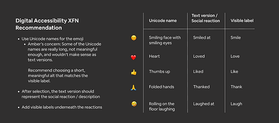
As the only writer for the first 6 months, I wrote every piece of copy: the settings, the names of the reactions, the names of the categories, the information architecture of the inbox, the names of the roles, the information architecture of how the names and roles appear in a thread with the time stamp, the new user education of the redesigned inbox, and strategy around filtering and reservation statuses. Phew! It was full on. And the results are beautiful.
Emoji reactions


New user experience (NUX) education


Systems Writing
Airbnb, Twitter
Ideally, systems writing stands the test of time. It's clear, helpful, and shouldn't have to be updated often. The opportunity with systems writing is to investigate the corners of our product and brand every single moment — from a cookies disclaimer to a push notification to an error message, it's all part of the brand. And each message could be a customer's first experience of us. Why not make it look and sound like us? Why not make it delightful?
Airbnb push notifications
Our push notifications hadn't been updated in awhile. Also, an audit revealed that there were over 100 push notification messages in use. It was too much, and they were using an old pattern of design that the company was slowly, but surely updating with the new system.
We started by testing the push primer. We got different signals on different platforms, but were able to synthesize the test results to land on the right messages for the right delivery components. There's a lot of fine-tuning to be done here, and the team re-tests often.


Airbnb cookies disclaimer
I worked with a Design System designer and members of the Legal team to put together copy and guidelines for an updated cookies disclaimer. The disclaimer had to meet all the requirements of GDPR and other laws in the geographies in which we operate.


Twitter alt text badge, reminder, & education
The Accessibility Experience Team spent countless hours, sleepless nights, and blood, sweat, and tears making Twitter more accessible for people with disabilities. The largest cross-functional project we embarked on was to bring image descriptions (also known as alt text) to the platform.
There were millions of images shared on Twitter, and none of them were accessible to people who were blind, low vision, or couldn't load images on their device (perhaps because of low bandwidth). We changed all that by:
-
making it functionally possible to add descriptions to images
-
creating the ALT badge to let users know which images had descriptions
-
launching an ad campaign to publicize the feature
-
launching a reminder setting to encourage users to add descriptions
-
launching an education series including in-line help as well as how-to Help Center articles
I wrote all of these pieces of content. For the Help Center articles, I worked closely with a system designer to get the right assets, copy, and layout for each article. The articles included How to add image descriptions (for Android, iOS, and web), How to write great image descriptions, and How to use the ALT badge and GIF label.


